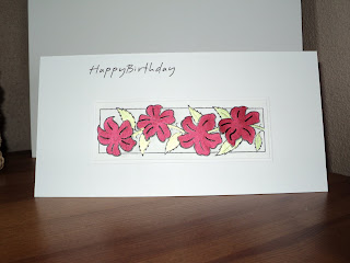
This week brief on the less is more challenge blog was a 'touch of red'
Sentiment printed directly onto a DL card with the help of a fab tutorial on Kerrys blog
Image (Hobby arts Border flowers' stamped twice coloured with cosmic shimmer paints
Flowers cut and decoupgaed
mounted onto white card before attaching to main card.
As always thank you for looking, any comments welcome.
x


14 comments:
Beautiful card Chris xx
This is a lovely clean and simple card with a super touch of red!Just love those flowers!
I'm so glad you could join us and enjoy the rest of your week!
Chrissie
"Less is More"
It's beautiful Sandra and thanks for the mention :)
Kerry x
gorgeous card sandra.the flowers are stunning :D
xx coops xx
Hi Sandra beautiful card!!
Great layout for this card, really effective...love it!
Diane x
this is lovely, the red and gold looks great. x
Great to see you, love those flowers
Thanks for your entry
mandi
"Less is More"
Lovely card, great composition.
Jennie
Contemporary looking and elegant card:-)
Sweet and simple...perfect!
Lovely sweet and simple card. x
Hi Sandra, your card is really pretty - the red is so vibrant. Love it! Sarah
Super card, love it
Ali x
Post a Comment
Thank you for taking the time to comment on my cards, really apperciate it. xx